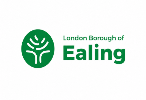
After many decades with largely the same branding, Ealing Council is getting a new look after unveiling a redesigned logo today (27 May 2026) which will begin appearing across its services, website, vehicles and digital platforms.
The updated logo, which replaces a design used for decades, has been created by the council’s in-house communications team.
The wording on the logo has also changed from “Ealing” to “London Borough of Ealing” to reflect the whole borough rather than one town, while the redesigned branding also represents Ealing’s seven towns — Acton, Ealing, Greenford, Hanwell, Northolt, Perivale and Southall.
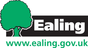
Explaining the reasoning behind the rebrand, the Labour-run council said: “The council’s old logo had been used for decades, with only minor alterations over the years. However, it was no longer fit for purpose. It did not meet national accessibility standards that the council is required to follow and predated the development of digital media.”
The council added that the in-house redesign had been developed at no extra cost and would be introduced gradually to avoid unnecessary spending.
Describing the new branding, Ealing Council said: “The new logo is still a tree, maintaining a link to the borough’s historic coat of arms. It has been created to have 7 components, reflecting the 7 towns in the borough.
“The distinctive ‘fingerprint’ shape reflects that, while the council supports those distinct 7 towns and their communities, it also believes in respecting the individuality of each of the people it serves.”

 which will begin appearing across its services, website, vehicles and digital platforms.)